


This article explores the seamless integration of Riverpod's state management capabilities with Flutter's theming system, enabling you to create dynamic and customizable UIs, you will learn how to define and update themes and leverage Riverpod's providers to manage accent color with ease.
There are several techniques to manage users' preferences and allow them to choose dark or light themes, which can be considered a feature that all applications should have, and accent color to change the application's theme. This last feature is not so common because often colors inside the application are imposed by the brand or recently they are increasingly using the system theme as described by the Material You guidelines on Android and which is mainly based on this aspect:
custom palettes that emphasize expression and accessibility are algorithmically generated based on your brand or—starting with Pixel—an individual’s wallpaper
However, wanting to give default choices to the user we will see in this article how to set up an application so that it is easy for the user to change preferences and see in real time how the theme of the application changes.
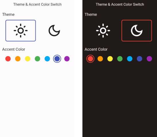
The final application is this and allows you to choose whether to use the dark or light theme and set the accent color with which all the colors related to the theme will be created:
Main aspects and implementation
The only essential dependency that we will need in this project will be Riverpod which will handle the application state and the theme and accent color information so in our pubspec.yaml we are going to add the flutter_riverpod dependency:
dependencies:
  ...
  flutter_riverpod: ^2.3.6
At this point, we wrap the whole application in the ProviderScope to make Riverpod manage the application state:
void main() async {
  WidgetsFlutterBinding.ensureInitialized();

  runApp(
    ProviderScope(
      child: App(),
    ),
  );
}
To read and update the status of the theme and accent color, the most important part of Riverpod is used: providers. Providers are objects that contain within them a state and allow this state to be read and modified. In particular, in this application it was sufficient to use a StateProvider since the information that needs to be managed is "simple": Brightness and Color. So I create a theme_provider.dart that will contain two providers that will manage the dark and light theme and accent color of the application:
final isDarkModeProvider = StateProvider<Brightness>((ref)
                               => Brightness.light);

final accentColorProvider = StateProvider<Color>((ref)
                               => Colors.indigo);
To manage the change of accent color, the custom widget was created AccentColorButton whose basic parts are:
Widget build(BuildContext context, WidgetRef ref) {
    //reference to the accent color provider
    final acProvider = ref.watch(accentColorProvider);
    double size = 32;

    return InkWell(
      //On tap I update the provider value by changing its status
      //to the new color selected
      onTap: () => ref.read(accentColorProvider.notifier).update((state) => color),
      child: Container(
        decoration: BoxDecoration(
          border: Border.all(
            ...
            //I update the color of the button's border
            //by making it color if that button has been clicked
            color: acProvider == color ? color : Colors.transparent,
          ),
          ...
        ),
        ...
      ),
    );
  }
An entirely similar argument can be made for the ThemeButton widget that takes care of reading and updating the status of the brightnessProvider.
To update the entire style of the application, it is then sufficient to add in the MaterialApp the reference to the two providers:
Widget build(BuildContext context, WidgetRef ref) {
  return MaterialApp.router(
    ...
    theme: ThemeData(
      ...
      colorScheme: ColorScheme.fromSeed(
        seedColor: ref.watch(accentColorProvider),
        brightness: ref.watch(brightnessProvider),
      )
    ),
  );
}
Conclusions
These customizations are usually added in the settings section of the app to allow the user to customize their user experience, but in this article, we have placed them directly on the home page to give them more importance.
In this GitHub repository, you can find the source code of the application developed for this article: theme-accent-color-switch-flutter.
Code strong, Alberto